Welcome to the Datanyx Community!
Get Help, Learn Best Practices, Network With Other Datanyx Users

Notifications
Clear all
Topic starter
04/01/2023 9:56 am
Step 1: On the top right corner of the page, click on visualization under properties. Click on the Geo Chart icon under properties. (Refer to the image below).
Step 2: Drag and drop the required columns in dimension and measure. The data is represented in the form of a Geo Chart.
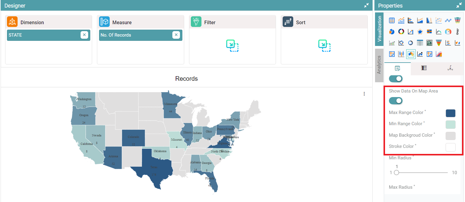
Step 3: Under properties, click on geo chart option. The user can choose the Country, State, enable labels, heat range and can choose to show the data on map area. (Refer to the image below).
Step 4: Enable the show data on map area toggle and choose the max range color and min range color. The user can also change the background color of the map, stroke color, min radius and max radius. (Refer to the images below).


